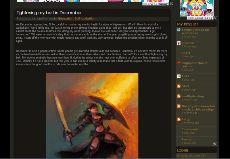
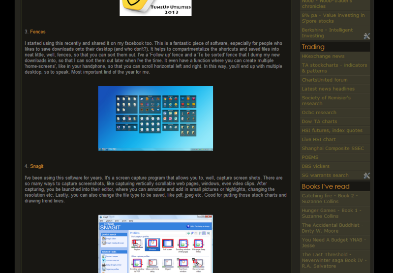
It's time to change a new template for bullythebear.
It had been 5 years since I've last changed a new template, so I guess the time is ripe for another change. This change will make the 3rd major change since I started since blog. As always, it'll be dark themed. So if you're waiting for Bullythebear to have a white based theme, haha, wait longer! I think darker themes is easier on the eyes when reading, at least to me. Since the current template had been with us for 5 years, I guess that there'll be more resistance. But as always, trust that the change is good, if you can be patient and grow to like the new changes, as you've always had done so in the past :)
These days, more people are reading off hand phones and tablets, rather than desktop and laptop. The on-the-go kind of mobility means that the template got to have less loading time and also be able to fit aesthetically into the palm size screen of tablet and hand phones. For the current template, I always have to scroll horizontally, if not the fonts are too small to read comfortably on the handphone. I'm not sure if I'm the only one to have this problem, but no one had complained to me about it before. The usual complaints are that the screen/fonts contrast are too weak, so it makes reading the words hard. Well, I'll try my best to make the contrast a little better, but it'll never have that strong in-your-face contrast of white background against black fonts for white themed templates - something I really hate reading on.
The usual elements of bullythebear will be there, like the cbox, some nuffnang ad elements (lesser and hopefully less intrusive) and some ads that I designed. I'm not so hard up about ads anymore. Financial bloggers earn peanuts from ads anyway, so let's not kid ourselves. Obviously, I'll have to change the colour themes of the cbox to make it more suitable for the new template, but I think a lot of regulars will complain too, haha! 5 yrs is a long time to grow attach to something that I check everyday :)
For records sake, I'll be putting screenshots of the current template here. It's good to see how far we've come to by looking at previous post.
Huat ah....be well and prosper :)
Wednesday, November 27, 2013
Subscribe to:
Post Comments
(
Atom
)


7 comments :
Very futuristic. I like.
Hi Money honey,
Thanks! Much appreciated!
Hi LP,
I am one who prefers a white background but this new design is already a lot better for my reading.
Still remembered the days flipping though your archives and finding the words pretty hard to decipher. Maybe I am the only one with this problem.
Hope to have more posts from you this month since you will be having more time during your lull period. It should also help that blogging is "kind to the wallet" compared to most other activities. =p
Hi 15HWW,
Oh, you're the one! Haha :) Sorry! I always tell people that if they have problems reading the post, just read the RSS feeds, it'll convert the background to white and the words black ;)
Yeah, had done more and will do more posts in my quieter months :)
Hi LP,
You are tempting me to overhaul my site. LoL.
The new layout is more organized and it helps your articles stand out. However, I have to agree with HWW that it's quite tiring on the eyes after a while, but luckily as a regular reader I don't have to flip through your archives.
I encountered a minor inconvenience. On a small screen (I'm using 8.9" Eee PC), the social media buttons on the left covered up some letters. The mobile version is fine though.
Cheers!
Derek,
Just do it! It had been many years since I saw a major overhaul in your site ;) I bet it'll be a refreshing change haha
I know what you mean by the media buttons covering up some letters. I saw it on other sites too when I really squeeze the windows to a narrow strip.
Let me see what I can do about it. I'm pretty new to the social media sharing coding...the built in social media buttons don't work out for me, hence this outsourced one.
Derek,
I just changed the social media buttons on the right side now. I've tried putting the sharing button just after the post and before the comments, but it just wouldn't work for my template.
Oh well, this seems to be the best option. Let me know if you still have any more feedback, thanks!
Post a Comment